Lists in OneNote
Overview
OneNote is a general-purpose notetaking app that lets you do many things. One of its top uses is creating lists. I was asked to explore how to improve the lists experience for our users.
I designed an experience that matches people's existing list habits. I investigated how people make and use lists to form these goals:
- Make it quick to add new lists
- Rely on the keyboard as the primary UI element
- Allow big tasks to be broken down with subtasks
- Filter out the things you have already done
It shipped on iPhone in June of 2015.
Learning From People
I formed goals mainly based on talking to people. During dozens of user tests or interviews (many for unrelated projects), I'd take time to ask participants about how they use lists.
I interviewed a variety of students and workers. Some of them used paper, some an app; most used both. When possible, I would have them guide me through their actual lists.
Most Notes Are Lists
People care most about remembering specific things that they need to do. The majority of notes they take are lists.
Most Lists Are Short Lived
List accumulate cruft the longer they're in use. People frequently make new lists to start fresh. Paper lists necessitate this, but people do it in apps too.
People Use General Apps
People favor general-purpose apps (Apple's Notes, Google Keep, Evernote) over list-specific apps. General-purpose apps provide a familiar editing experience and people don't see the benefit in learning something new.
People Use Subtasks
When available, people use subtasks to break work down. Paper notetakers do this intuitively with indentation.
It's Hard to Manage Long Lists
There are still some long-lived lists. People keep lists like "Movies to watch". With many items, these lists become cumbersome on paper or in simple apps.
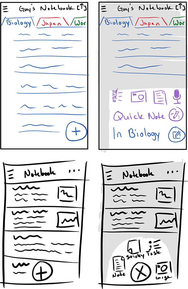
Learning from other Apps
There are an endless number of list apps across iOS, Android, and desktop. I looked at some of the top apps to see how they well they served people's habits.
Con: List Creation Feels Heavy
Most list apps make you name your list before adding any items.
People make lists when they are afraid they'll forget something. Making people name lists at creation time adds extra steps.
Con: Unfamiliar Text Editing
Most list apps have their own methods for inputting text. Often, each list item feels like its own island, separated from the rest of your stuff.
These apps defy people's expectations about how to work with text. And people don't want to learn something new.
Con: Hard to Break Work Down
Many apps simply don't support subtasks. Others require users to work across different screens.
This makes it inconvenient to add subtasks or see them when you're looking for what to do next.
Pro: Focused on What's Left
Most list-specific apps filter completed and uncompleted tasks into two groups.
This lets you focus on what you still have to do, which makes it easier to work with big, long-lived lists.
Design Goals
Since lists are so important to so many people and because they make so many, I decided to create a new list-specific experience in OneNote.
Adding New Lists Is Quick
People make lots of short-lived lists. You should always feel like you can quickly create a new list.
Keyboard-Centric UI
Many list-specific apps defy peoples' basic expectations about editing text.
You don't want to have to learn how to enter stuff into an app. Let's rely on the keyboard and let you do it the way you normally would.
Allow Big Tasks to be Broken Down
This is a differentiator. Users do this frequently on paper and in OneNote.
Filter out the Things You Already Did
People keep important long-lived lists. They want to be able to easily separate what's been done from what's left.
Adding New Lists is Quick
People create lots of short-lived lists. I wanted the app to encourage you to make as many as you want.
Previously, in OneNote
In the old experience, you'd create a new page and then add a list to it.
However, when making lists, people think, "I want to make a list", not "I want to make a new page and add a list to it". OneNote's model didn't match users' thought processes.
Matching Your Mental Model
A pattern in many apps is a creation button that expands to show several options to choose. In this flow the user:
- thinks, "I want to create..."
- presses the button
- finishes the thought, "... a list", by selecting the option
This pattern worked for OneNote lists and allowed us to showcase other kinds of notes.
Quickly Write What You Want to Remember
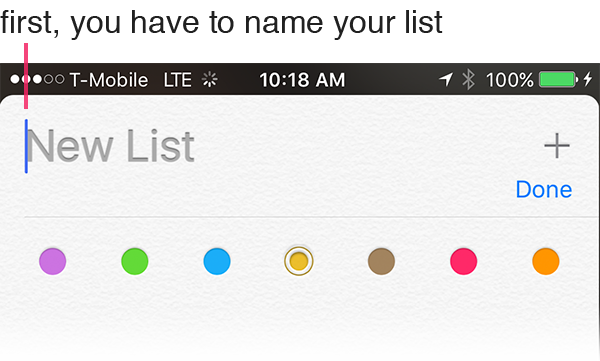
People make lists because they want to remember the items of the list. However, many apps force you to name lists up first. This slows you down from recording whatever you wanted to remember.
OneNote places focus in the body of a new list. The list doesn't need a name.
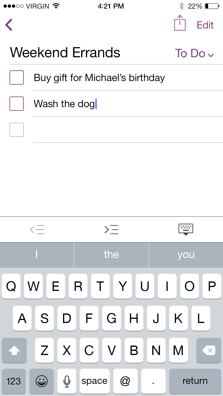
Keyboard-Centric UI
People are super comfortable typing text on their phones. I felt the keyboard should be the primary interface for editing your list. Starting typing, continuing typing, and fixing your mistakes should work like it does across the rest of your phone.
Normal Way to Start Typing
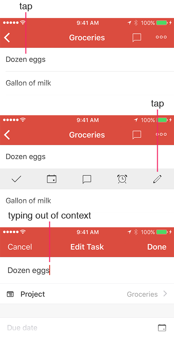
Normally you just tap some text to type right there. Many list apps make you tap multiple times or make you leave your context to edit items.
In OneNote, you just tap and type right there.
Just Keep Typing
When you're adding a bunch of stuff to a list, you generally write down the most important things first.
Many list apps always add items to the top of a list, which results in your items being in reverse order.
In OneNote, you tap Return and keep moving down, so things are in the right order.
Go Back And Fix Your Mistakes
People make typos. Sometimes they change their minds. In almost all list specific apps, you can't just tap backspace to go back to fix a previous item.
In OneNote, just tap or hold backspace to go back to a previous line.
Allow Big Tasks to be Broken Down
Breaking big tasks down helps users accomplish their goals. People naturally do this on paper.
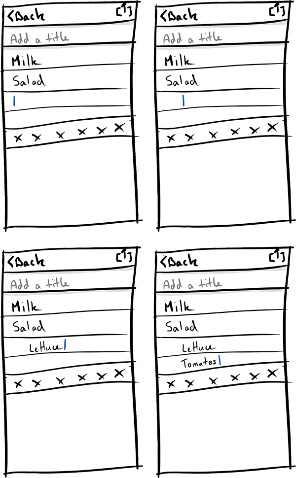
Just Like on Paper
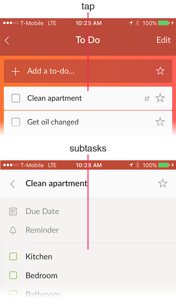
People come to a list to see what's left to do. Other apps that support subtasks show them in a subview, which makes it harder to get the big picture of the work you have to do.
In OneNote, you just indent your list to indicate subtasks. You can see everything at once.
Using UI You Already Know
OneNote already supports indentation in normal note pages.
Lists use the same UI to accomplish indentation as normal pages.
The user can also execute the same shortcuts from the keyboard, like tapping Backspace at the beginning of an indented task to unindent it.
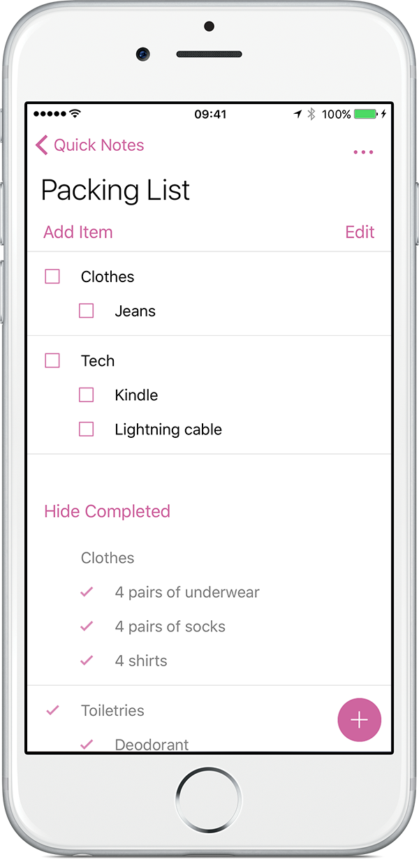
Filter out the Things You Already Did
People make big lists. It should be really easy to tell what's left to do and what you've already done.
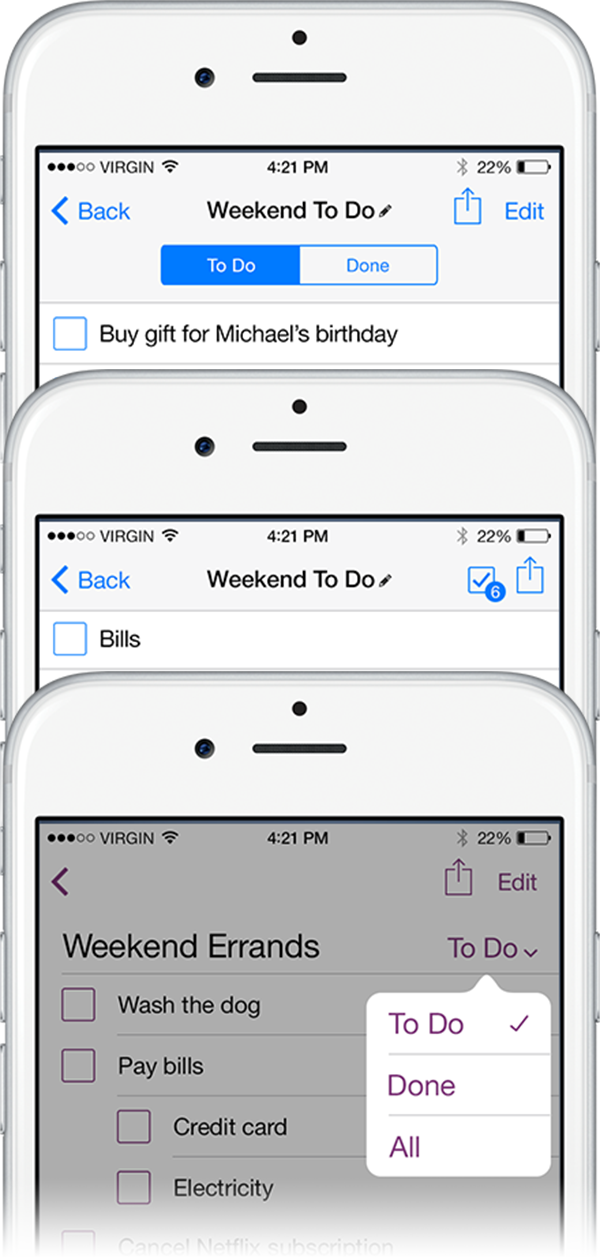
Where Should Completed Items Go?
I created mockups to explore different concepts of how to filter what's left to do from what's already done.
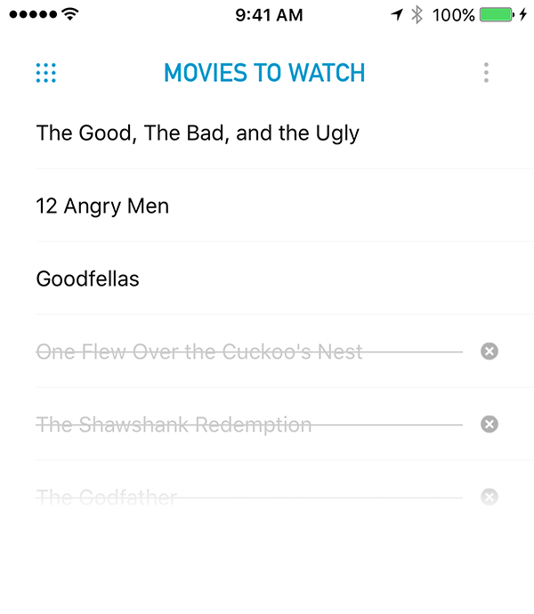
In the app, items are shown below uncompleted items. This requires more scrolling than other models, but usability tests showed it was the most understandable.
How to Show Completed Subtasks?
For many subtasks, their hierarchy provides context to understand their meaning. I needed to design a way to show completed subtasks with uncompleted parent items.
I came up with a "ghost parent" for completed tasks that have uncompleted parent items. The ghost parent shows hierarchy, but remains unchecked and isn't interactive.
Results
Lists shipped on iPhone in June, 2015. It recieved very positive user feedback.
Unfortunately, this project shipped just as Microsoft acquired Wunderlist. This, combined with OneNote's increased focus on education, resulted in lists lists being deprioritized as a OneNote scenario in favor of Wunderlist.