The Controls of Continuity 2: The Continuation
Overview
Continuity is a puzzle game for PC. After its success, we wanted to bring a sequel to iOS. One of the major challenges of developing Continuity 2: The Continuation was designing the game's controls for touch screens so that they:
- Never posed a challenge for the player
- Were comfortable for different play styles
- Were quickly learnable
Continuity 2 was designed and built by Stefan Mikaelsson and me. It was released in July, 2011. It has an 83 rating on Metacritic and a 4.5-star rating on the App Store.
Design Goals
Continuity is fun because it poses a mental challenge. I wanted the game to appeal to a wide array of players without posing any physical challenge to them.
Never Challenging
The challenge and fun of the original Continuity is in figuring out how to solve each puzzle. The controls should stay out of your way and not add to the challenge.
Comfortable to Hold
Through playtesting, I found different ways that people are most comfortable holding their phones. I hoped that by designing for different preferences, the game would appeal to a wider audience.
Quickly Learnable
As an inexpensive mobile game, you have little investment in sticking with the game. You should be able to quickly master the game's controls so that you can get on to solving puzzles and having fun.
The Original Continuity
Continuity is a puzzle game played on your PC in a browser.
In each level, the player must move the character to collect the key and reach the door.
You use two modes to do this:
- Zoomed in: move character
- Zoomed out: rearrange tiles
You play the game using a keyboard.
Reducing the Challenge
I began the by identifying the challenges posed by the original Continuity in order to minimize them for Continuity 2.
Identifying Challenge in the Original
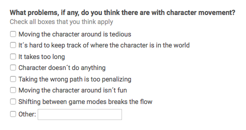
I conducted an online survey of the original Continuity's players to find out what was problematic with the controls.
It indicated that players felt lost when zoomed in. This made sense; when zoomed in, you can only see part of the constantly rearranging level.
Keeping You From Feeling Lost
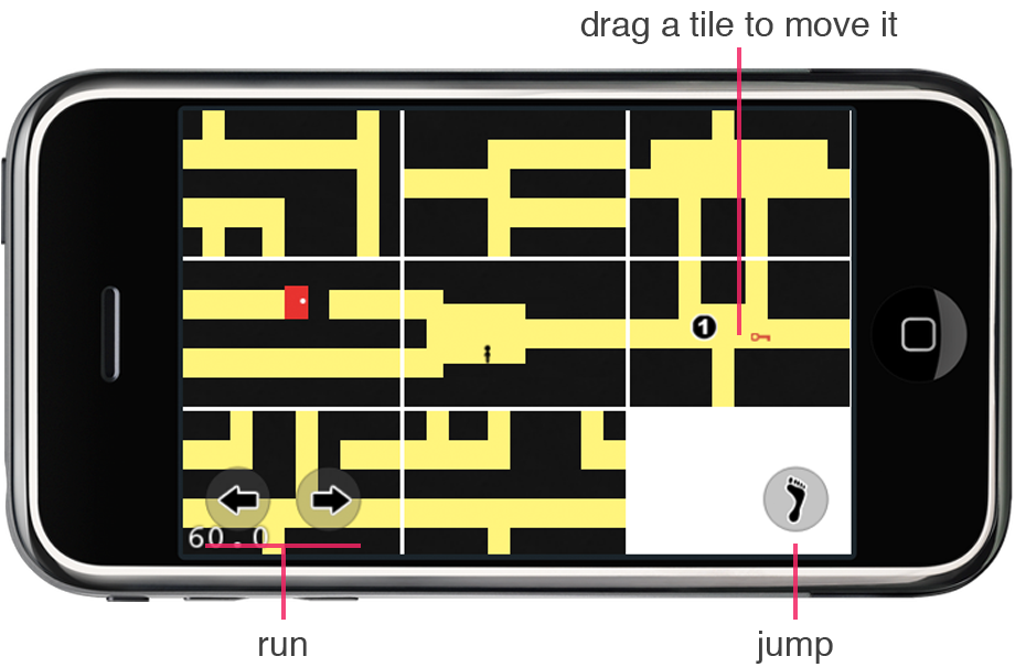
I created prototypes to help players always know where they are in a level. These prototypes used only one zoomed-out mode so that players could always see the whole level.
Playtests showed that this added more challenges
- Players struggled to move tiles with onscreen buttons overlapping them
- Players mistimed jumps due to the character being too small on screen
Am I Actually Meeting My Goals?
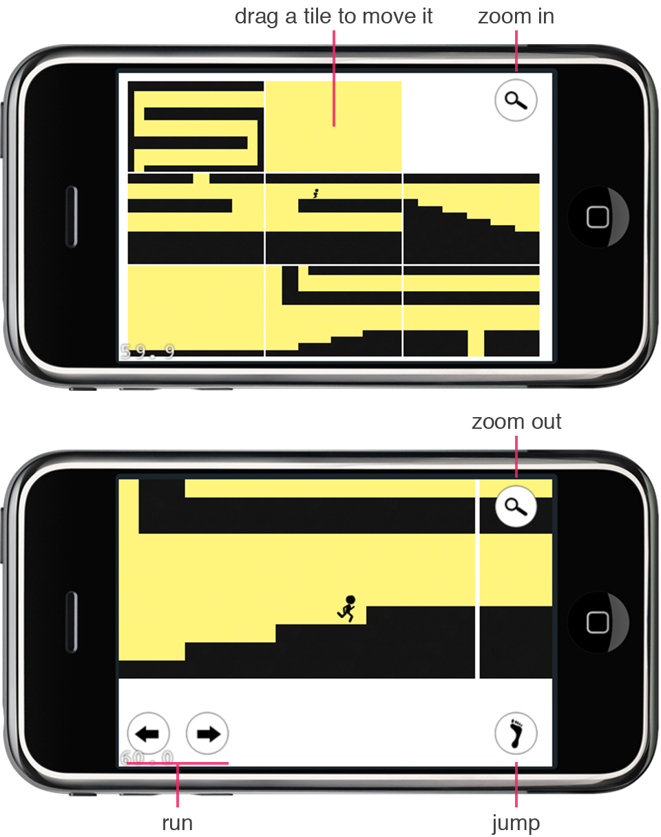
Trying to solve for the player feeling lost left players more frustrated. To compare, I made a prototype that worked in two-modes, like the original Continuity.
Players greatly preferred the new prototype. They'd still get lost, but found it simple to zoom out, get their bearings, and zoom back it.
Increasing Comfort for Everyone
In 2010, many people were not comfortable using their thumbs to control their phones. I changed Continuity 2's UI so that you could play with your thumbs or your index finger.
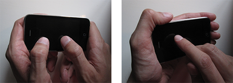
Identifying Different Grips
Players were meant to hold their phones like a gamepad and press buttons with their thumbs. Playtesting showed certain players would try to use their index fingers instead.
Small buttons along the bottom of the screen didn't work well for index-grip players.
Accommodating Index-grip Players
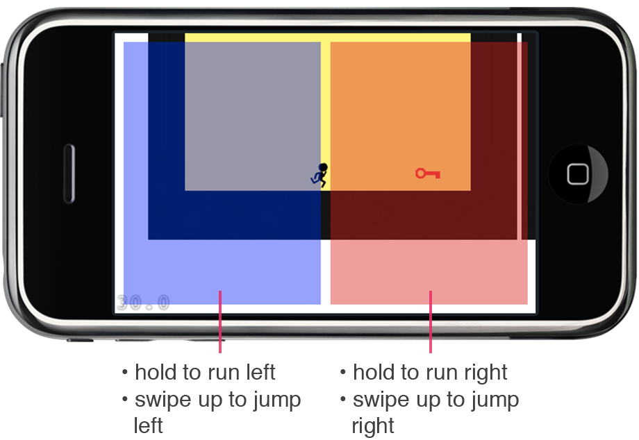
I modified the design to work well for both grip preferences. Instead of buttons, you pressed on either side of the screen to make the character run in that direction.
Playtesting showed that some index-grip players would swipe on the character to make it run. Since they touched to one side of the character, it would run a few steps, then stop. This positive feedback let players satisfice with their slow, physically exhausting approach.
Refining for Index Grips
I wanted to provide negative feedback to swiping the character. I introduced a "dead zone" in the center of the screen where touches (and swipes) were ignored.
After this change, players that tried swiping would see no result, and then go on to discover the desired way to play.
Teaching Quickly
I needed to teach players how to use the game's controls quickly so they'd stay engaged. I wanted to teach people as they play, so they don't feel like they have to sit and learn.
Trying the Same Thing as the Original
The original Continuity used static graphics to teach its controls. I used this same approach as a starting point for Continuity 2.
Playtests showed that Continuity 2's controls were too contextual for static images. Players didn't know which graphics to follow at any moment.
Teaching Contextually
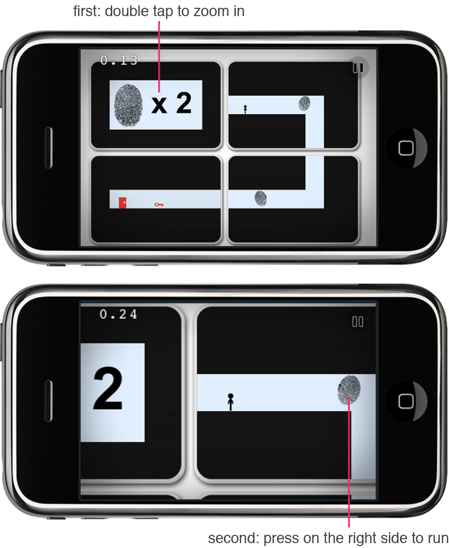
Through playtesting, I refined an interactive system to teach the controls for Continuity 2. Players learn concepts over the course of three small levels.
Each level first tells you what you'll learn and then shows you what to do with contextual animations.
Results
Continuity 2: The Continuation was released to the App Store in July, 2011.
It received IGN's Editor's Choice Award. It currently has a score of 83 on Metacritic. It has a 4.5-star rating on the App Store.
"Continuity 2 brings the browser formula to the touch screen without a hitch."
- JayIsGames
"I'll probably keep this one around long after I master all the challenge times, just to show people how neat iOS gaming can be."
- TouchArcade
"... a mobile heir apparent to the Portal 2 kingdom."
- Engadget