Commands UI for OneNote
Overview
Microsoft OneNote is a notetaking application that supports a bunch of different ways to take notes.
We were completely overhauling our Windows 8 app for Windows 10 and needed a new way to present all of OneNote's commands.
With a colleague, I designed an interface for OneNote's commands that:
- Conveyed what made OneNote special
- Was easily learnable
- Scaled to accommodate many commands
My main contribution to this project was to simplify the task by refocusing from designing novel interactions to revising information architecture.
This design shipped as part of the Windows 10 release in the Fall of 2015.
Design Goals
When I joined my colleague on this project, we defined three main goals for a new commands interface.
Show You What OneNote is Good For
When you start OneNote for the first time, it's hard to tell how it's different from other apps you already know and use, like Word.
The UI should show that OneNote helps you take and keep many different forms of notes.
Easily Learnable
The existing Windows 8 app used the Radial Menu for its commands. Usability studies showed many users struggled with the previous UI. Many never figured out how to fully use it.
We wanted new users to focus on exploring what the app was good for, not worrying about how to use it.
Scale to Fit Lots of Commands
OneNote for Windows 10 was adding more features quickly as it moved to reach feature parity with OneNote 2013. However, the Radial Menu didn't facilitate us adding more commands.
We needed a UI model that would be able to accommodate us adding many commands as the product grew.
Background
My colleague had been working on this project for a little while before I joined. She was trying to solve problems specific to the previous Windows 8 app in addition to some that had existed across all OneNote clients for years.
Users Love That OneNote Supports Many Forms of Notes
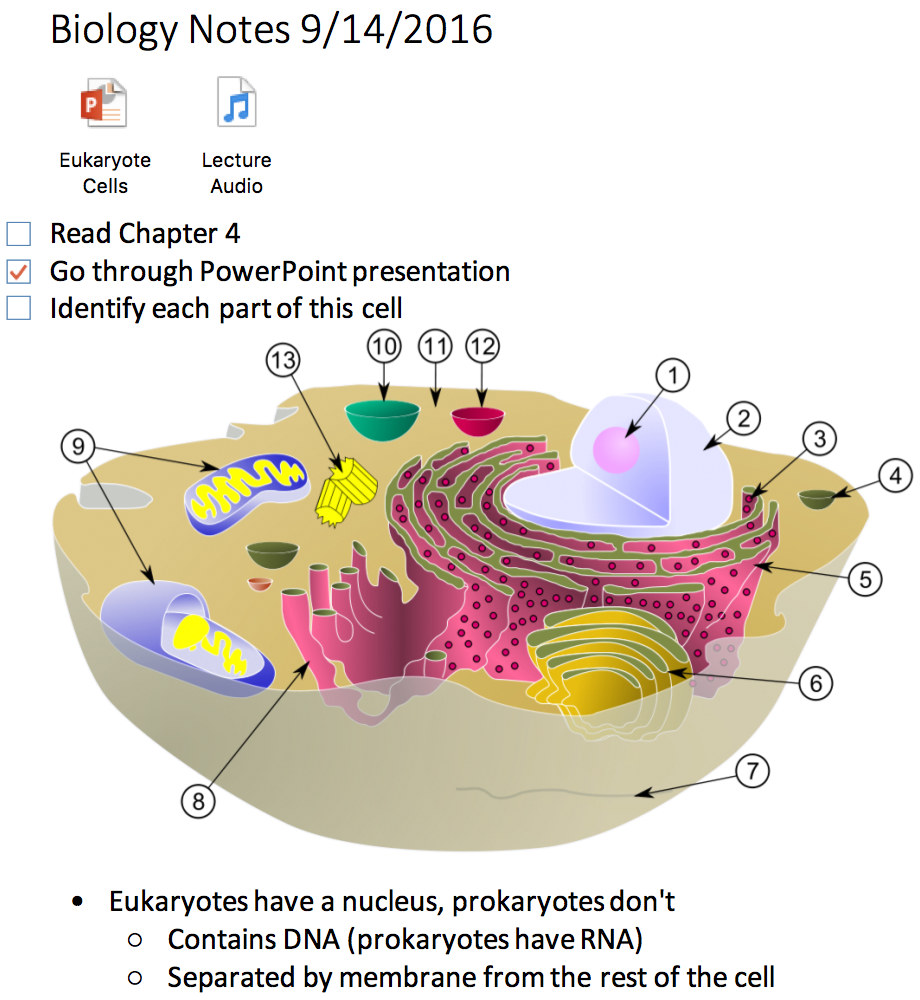
Microsoft OneNote lets you take many forms of notes in addition to text. Interviews and feedback showed users loved that they could:
- make to do lists
- add images, like scanned documents/whiteboards
- record audio
- attach files
- handwrite
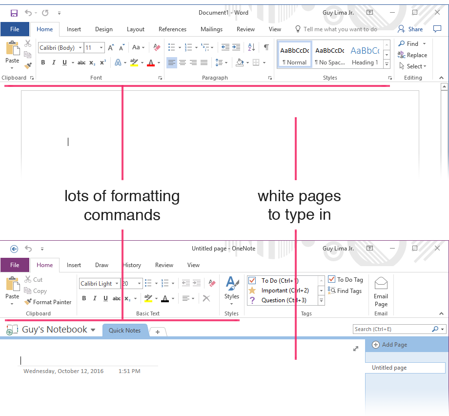
But On First Use, It Looks A Lot Like Word
For years, user studies and interviews told us that people didn't really get what made OneNote different from Word. Starting OneNote for the first time, they'd notice:
- A Ribbon filled with a lot of text formatting commands, just like Word
- A big white page where they can type, like Word (whereas Excel and PowerPoint have distinct canvases)
They would just walk away from the app unsure of how it was any different than Word, which they already knew and used.
We wanted to clarify that OneNote was a great place to store todos, images, audio recordings, and files that you want to remember later.
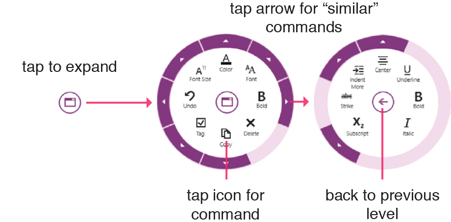
Need To Replace The Radial Menu
Unlike other OneNote apps, OneNote for Windows 8 put its commands in a Radial Menu that had two main problems:
- Usability: many users never figured out that tapping the arrow in the outer sector of the Radial Menu would show more commands
- Scalability: as OneNote grew, we were having issues adding commands; the Radial Menu could only house 8 per-level
We wanted to replace the Radial Menu with something that was easier to use and could accommodate the new features we were adding for the Windows 10 release.
Designing New Interactions Isn't Working
My colleague believed that elevating a few, key features to the top-level of the UI would help users understand OneNote's value.
She had tried to do this via designing new interactions for the Ribbon, like making it hidden by default or adding an extra row of buttons. But these changes didn't test well as they defied users' expectations of how to use the Ribbon.
Focusing on Information Architecture
My colleague's previous efforts had focused on changing how you interact with the Ribbon. When I joined the project, I explored if we could simply redesign its information architecture to better show OneNote's value.
People Have Learned The Ribbon
The Ribbon is a UI pattern that had been used throughout Office and Windows for over 7 years. Usability studies showed users were comfortable and capable using the Ribbon in OneNote apps due to their years of experience using it elsewhere. Changing how the Ribbon worked lead to usability issues as users had to learn something new.
Other Office apps showed that the Ribbon scaled to a huge number of commands.
As-is, the Ribbon solved usability and scalability. To simplify the design process, I proposed we clarify OneNote's value by changing the Ribbon's information architecture.
What's wrong with OneNote's Ribbon?
I formed the hypothesis that OneNote's Ribbon made the app feel like it was meant for composing polished documents rather than for taking notes for yourself. I identified three main problems:
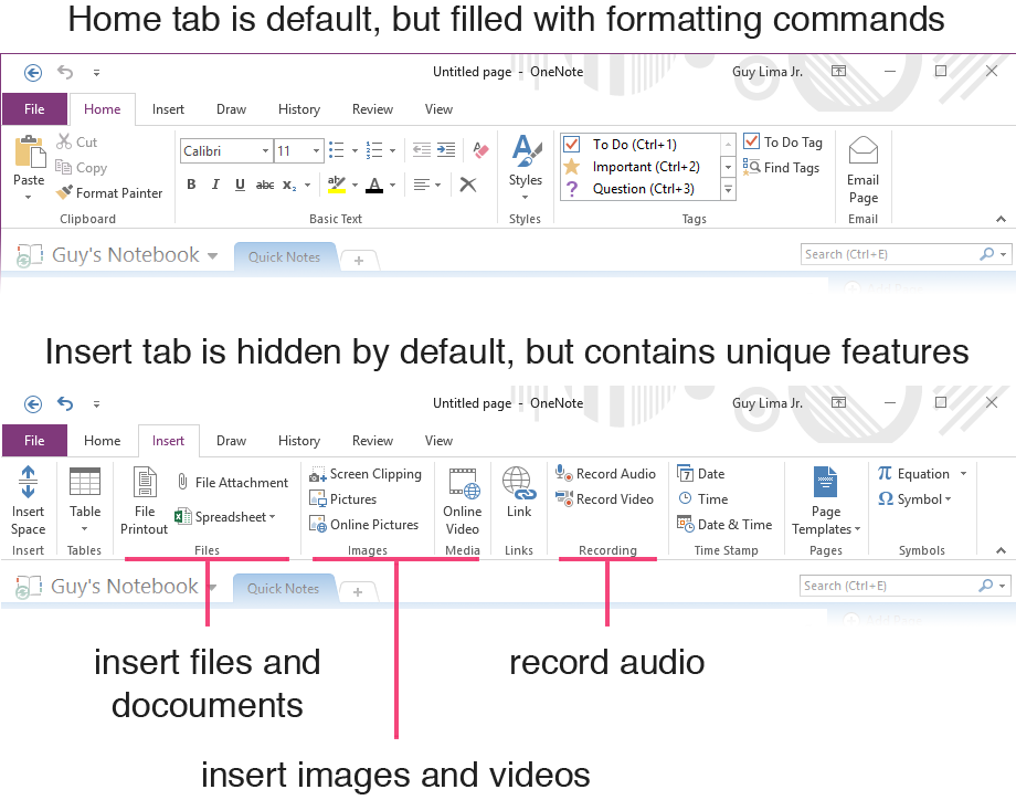
- The default tab was filled with text formatting commands, which make documents look good but aren't needed for notetaking
- That tab was called "Home", which made it feel like the place you're meant to spend much of your time.
- Commands that avid users loved, like insert picture, attach file, and record audio, were hidden in the "Insert" tab
Showing What Makes OneNote Special
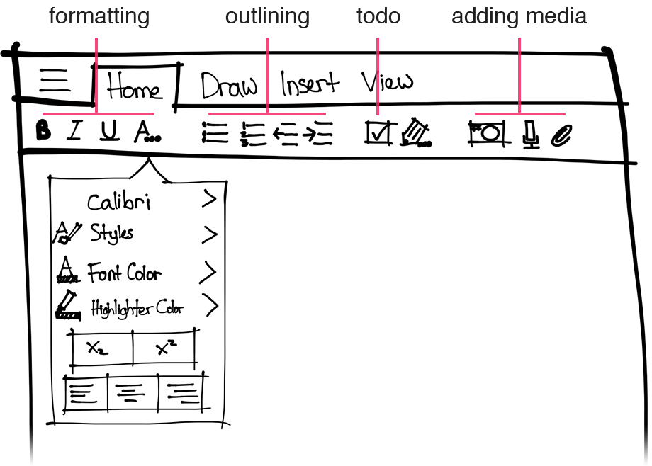
I sketched out various ways to make OneNote's Ribbon's hierarchy emphasize notetaking over formatting. My proposal:
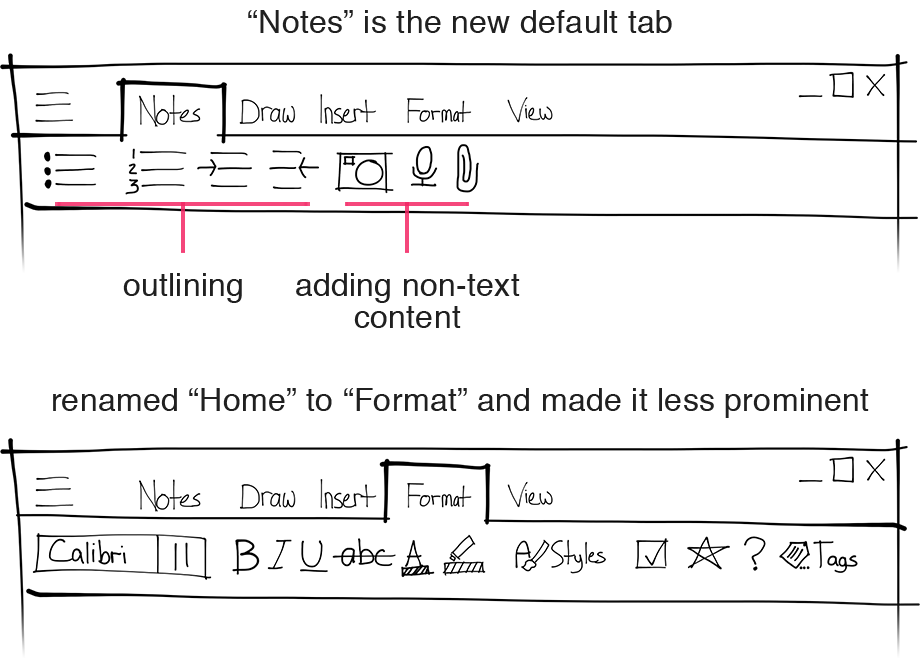
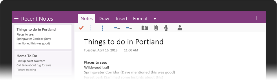
- Created a new default tab called "Notes"
- Filled the "Notes" tab with notetaking-specific commands like bullets, indentation, and capturing different kinds of notes
- Renamed the "Home" tab to "Formatting and deprioritized its order
Does It Work?
After sharing my work with my colleague, she created a low-fi prototype using PowerPoint and we ran user tests. We found that users:
- Good: identified use cases for OneNote by scanning the commands
- Bad: expected to be able to do formatting from the "Home" tab, like they did in other apps
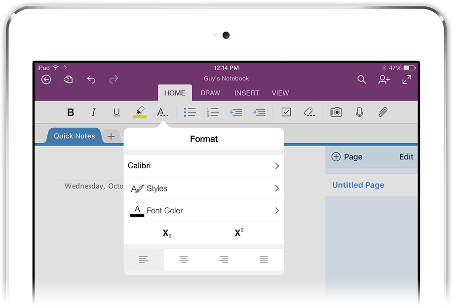
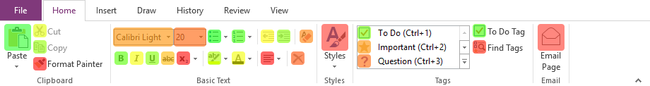
"Home" Remodel
Users had problems with formatting commands not being in the first tab, like they are in other Office apps. I set out to redesign the Home Tab to provide access to formatting commands, but emphasize the commands that made OneNote unique.
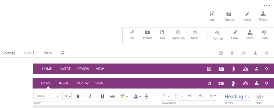
Prioritizing Commands Based On Data
I used a heatmap, created from analytics, to determine which formatting commands were most-used in OneNote. This helped me ensure the right commands would be available at the top-level.
Merging Notes and Formatting
I sketched different information architectures that placed the top-used formatting commands and the uniquely notetaking commands at the top-level of the "Home" tab.
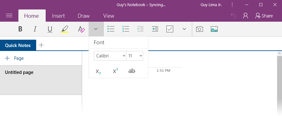
I placed the less-used formatting commands in popovers, at the second-level.
Making Sure It All Fits
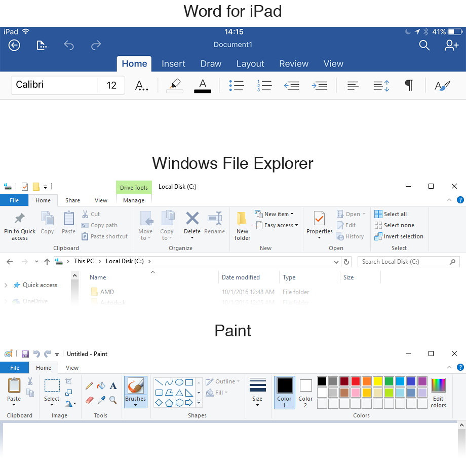
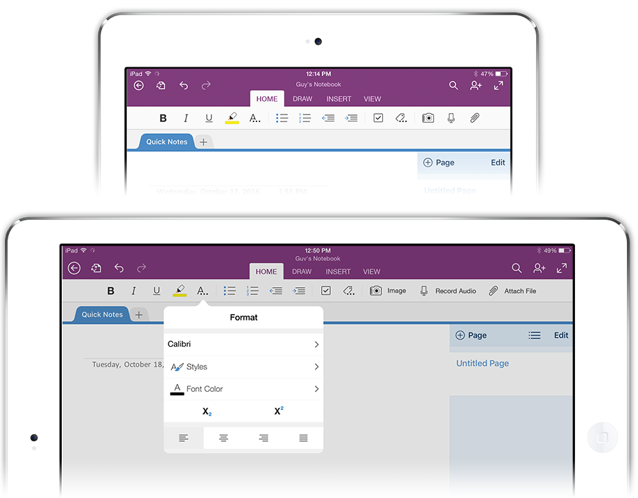
My colleague and I created pixel-perfect mockups for how the UI would respond to different screen sizes.
Since increasing user comprehension of OneNote's value was a cross-platform goal, I created mockups for iOS. She handled Windows 10.
Results
This design shipped as part of OneNote's Windows 10 app in late 2015.
User tests showed that this new model greatly increased users identification of OneNote's main selling points.
Usability studies showed that the overwhelming majority were more competent at using the updated Ribbon than the Radial Menu as they could leverage their preexisting knowledge.
Using the Ribbon made it easy for us to add new commands to the UI as they came online.t