The Gameplay of Continuity 2: The Continuation
Overview
Continuity is a puzzle game for PC, released in 2009. After its success, we wanted to create an iOS sequel to make some money. As a two-person team, we needed to design a small set of changes to:
- Fix the major problems from the original
- Enhance and expand on the fun of the original
- Make something that felt tailored for mobile devices
Continuity 2 was designed and built by Stefan Mikaelsson and me. The early design work was mostly shared.
I created the vast majority of the 137 puzzles that we produced for Continuity 2. I extensively playtested the game to create, cull, and edit puzzles to make the best use of the gameplay mechanics we'd developed. The game shipped with 51 levels.
It was released in July, 2011. It has an 83 rating on Metacritic and a 4.5-star rating on the App Store.
The Original Continuity
The original Continuity is a puzzle game where players delight in figuring out, for themselves, how the game's mechanics work. You move control the game using two modes:
- When zoomed out, you move the tiles.
- When zoomed in, you move the character.
In each puzzle, you must navigate the character through the maze to collect the key and reach the door.
Design Goals
We'd playtested the original Continuity a lot and wanted to eliminate problems we'd observed. We also wanted to expand upon what players liked about the original.
Less Punishing
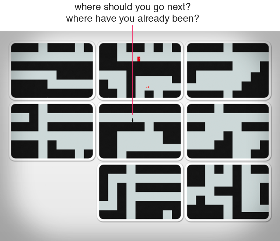
One of the biggest problems in the original Continuity was that players lost too much progress when they died. This left them frustrated and discouraged.
After dying, the character would respawn either at the beginning of the puzzle or where the character collected the key. You could lose minutes of progress due to a small mistake.
Clearer Subgoals
It was hard to identify progress within a large Continuity puzzle. Playtesters couldn't tell whether they were on the right track or not.
Players lost interest without some positive feedback.
More Puzzles Per Pixel
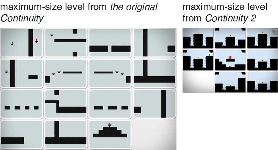
Continuity 2's level size was designed to keep everything clearly visible while zoomed out on a 3.5-inch phone. This results in significantly smaller puzzles than in the original.
We needed a way to fit a similar amount of challenge in less space to keep the game from being too easy.
Even More Continuity
In both games, the character can only move between tiles when their edges form a continuous image. However, in the original, you only ever need to match two tiles at a time: the one you're leaving and the one you're entering.
Making continuous matches was a unique aspect of the original that players really enjoyed. We wanted to enhance this fun for the sequel.
Hidden Surprises
Players especially enjoyed moments where they felt like they'd discovered new aspects of the game all by themselves.
In the original Continuity's 13th puzzle, the player figures out that the gravity is paused when the world is zoomed out. This has been true all along, but the player needs to make this discovery here to progress.
For Continuity 2, we wanted you to feel delighted by discovering something that was hidden in plain sight.
Designed for Mobile
In early 2010, many mobile games felt like they only existed on iOS to cash in on the App Store's success.
We wanted Continuity 2 to feel like it needed to be played on iPhone. We wanted it to feel intrinsically mobile.
Design Approach
Our team was small and we wanted to keep the game's scope small.
We chose to focus on concepts that were aesthetically minimal (so we were capable of producing them), logically simple (so we could code them), and that accomplished multiple design goals (so we didn't have to make too many).
In the end, we introduced just three mechanics. I used playtesting to learn how to create levels to best use them to achiever our goals.
Coins
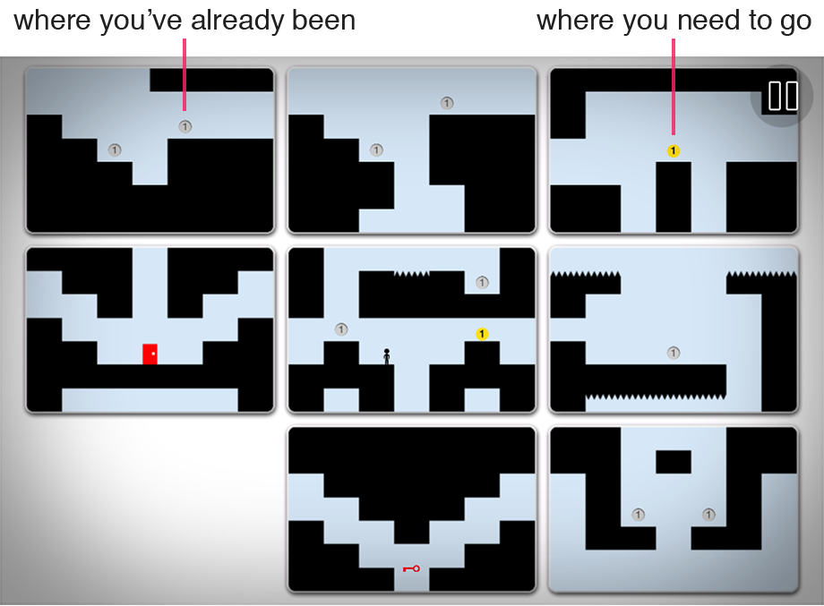
Optional pickup items are common in platforming games. We originally conceived of coins as a way just to give you a moment of delight whenever you picked one up. Through playtesting, I found that coins helped players form subgoals and could make the game less punishing.
Coins are present from the very beginning to help you out.
Clearer Subgoals
I found that playtesters figured out where they needed to go by noticing which coins they'd collected and which they hadn't. They formed subgoals to move toward the coins they'd not yet collected.
Through playtesting, I found players felt best when they were always moving forward. I'd identify areas where playtesters would get lost and added coins to help guide them along.
Less Punishing
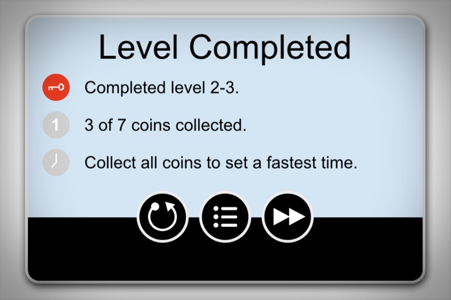
Since coins are scattered throughout puzzles, we decided they could also serve as checkpoints. If you die, you go back to the location of your most-recently-collected coin, which probably wasn't so long ago.
I'd add coins to puzzles wherever playtesters frequently died in order to minimize frustration.
Bonus: Optional Challenges
We realized coins allowed us to add extra rewards for players that collected all the coins in a puzzle and an additional reward for those who did so quickly.
We designed an achievement system to encourage replayability.
Rotation
One of the first things we explored was whether players would enjoy rotating their devices to alter the game's gravity. They did, so the concept stuck.
This mechanic was a hidden-in-plain-sight surprise that let us design denser puzzles, and felt designed for mobile devices.
Rotation is introduced about a third of the way through the game, just as you're getting a basic handle on things.
Hidden Surprise
In the 21st puzzle of Continuity 2, you discover that you have to rotate your device to change the direction of the game's gravity. You've been able to do this the whole game, but only now have you had any reason to try it.
By puzzle 21, playtesters had played the game for almost an hour. They were shocked and delighted when they discovered rotation.
More Puzzles Per Pixel
In the original Continuity, the character runs down empty hallways. In Continuity 2, I used rotation and spikes to create little extra challenges for players as they moved around the level.
Most of these rotation "puzzles" are quite simple. But playtesters felt clever for overcoming small, frequent obstacles.
Designed for Mobile
We were concerned that playtesters would grow tired of turning their phones, but they didn't. Playtesters found it physically simple, uniquely fun, and specifically mobile.
The design paired well with Continuity 2's touch-screen controls, which work great in any orientation.
Bonus: Puzzle Variety
Through producing and testing many levels, I found lots of novel uses for the rotation mechanics, which added more discoveries for players to make.
In this puzzle, the player rotates the world back and forth to guide the character without it touching the ground.
Levers, Wires, and Gates
I was primarily responsible for the design of levers, wires, and gates.
Wires cross tiles to make the world feel more continuous. They also create explicit suboals and increase puzzle density.
They show up two thirds of the way through the game, right as the you've gotten used to solving puzzles with rotation.
Even More Continuity
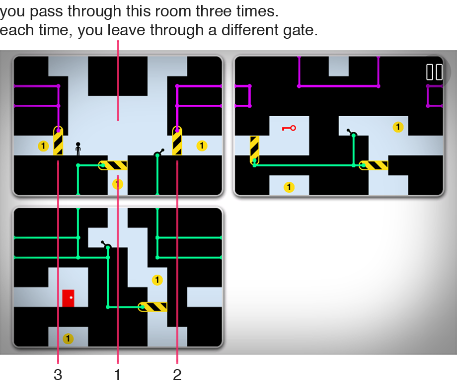
Flipping a lever when it is connected to a gate by a series of wires, opens or closes the gate. Wires can connect levers to gates across several continuous tiles.
I found puzzles work best with multiple continuous arrangements. Generally, you need to create one configuration to connect the lever to the gate, but another to move from the lever to the gate.
Clearer Subgoals
A closed gate is an obvious barrier. You know you need to open it. You feel like you've made progress when you do.
In this puzzles, once you open the gate, you can get the key.
More Puzzles Per Pixel
Gates can be remotely opened to offer new paths out of previously visited rooms. This let me create puzzles where the same areas serve multiple purposes.
Bonus: Puzzle Variety
Through iteratively creating and playtesting puzzles, I found that I could make many different types of puzzles using levers, wires, and gates.
Normally, you need to open gates, but in this puzzle, you need to close the gate to create a bridge.
Results
Continuity 2: The Continuation was released to the App Store in July, 2011.
It received IGN's Editor's Choice Award. It currently has a score of 83 on Metacritic. It has a 4.5-star rating on the App Store.
"Continuity 2 brings the browser formula to the touch screen without a hitch."
- JayIsGames
"I'll probably keep this one around long after I master all the challenge times, just to show people how neat iOS gaming can be."
- TouchArcade
"... a mobile heir apparent to the Portal 2 kingdom."
- Engadget