Handwriting in OneNote for iPad
Overview
OneNote is a notetaking application that supports many types of notes, like typed text, audio, images, and handwriting.
On Windows, users had been able to write in OneNote for years. In 2014, OneNote's top user request was to add handwriting support to iPad.
I designed a handwriting experience for iPad that was tailored for the needs of students. The work consists of two parts:
- Designing a UI that provides quick access to the tools students need
- Designing a physically natural experience for writing and manipulating OneNote's canvas
Handwriting shipped in OneNote for iPad in March 2015. This design served as the basis for Word, Excel, and PowerPoint across both iOS and Windows 10.
Design Goals
OneNote was seeing increasing usage in primary and secondary education. We'd seen handwriting demo incredibly well to students and iPad sales to schools were increasing. I selected students as my target users for this project.
Quick Color Coding
Class observations showed me that students color-code their notes. They needed to be able to quickly change between a set of distinct colors.
Write Naturally With a Stylus
Students write a lot of notes during class over a long period of time.
To write comfortably, students needed to be able to write with a stylus while resting their hand, just like they would with pen and paper.
Understanding the Space
Before starting designing, I needed to learn more. I needed to better understand how students worked in school. I also needed to study how iPads handled touches and styluses.
How Do Students Take Notes?
To better understand my target users, I visited a middle school where students used OneNote on Windows tablets to take notes.
I observed that almost every student wrote in several colors in order to color-code their notes. They would rapidly switch between different colored pens to record different meanings.
How Do Styluses Work on iPad?
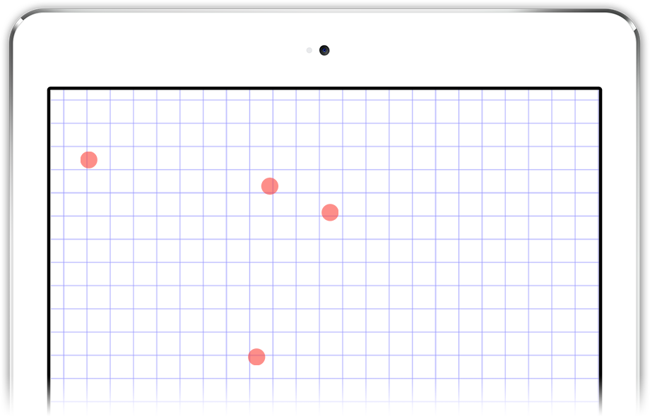
Before the Apple Pencil, iPad could not distinguish a stylus from a finger.
When you write while resting your hand on the screen, iPad can detect several touches. It's not obvious which touches are your hand and which are the stylus.
A naive approach would result in your palm leaving marks all over the canvas.
Quick Color Coding
I first set about designing UI that would enable students to fluidly color-code their notes while following along in class.
Understanding the Previous User Model
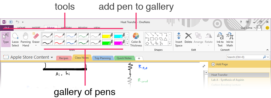
Usability studies and interviews showed people were happy with the handwriting UI in OneNote 2013.
It showed a user-customizable gallery of tools. Each tool was a specific combination of
- type (pen or highlighter)
- color
- thickness
This UI didn't fit in OneNote for iPad's Ribbon. OneNote for iPad featured a Ribbon was vertically smaller with bigger, touch-friendly buttons.
Exploring Alternative Models
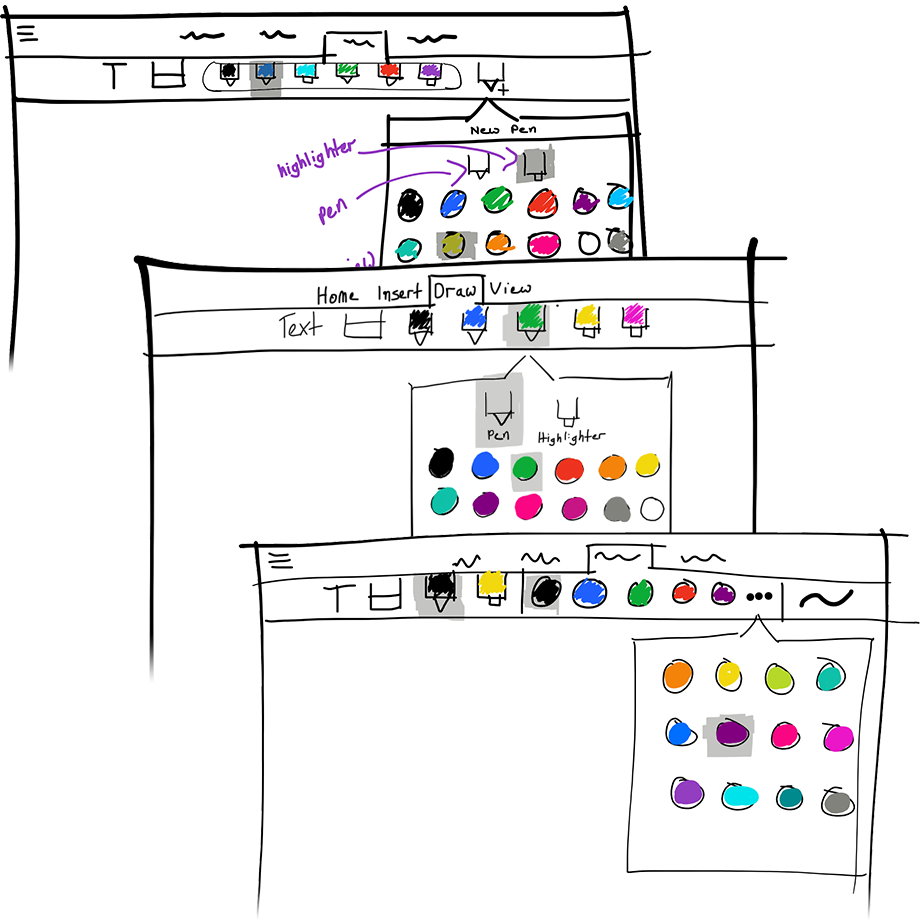
I used sketching as a way to explore the design space and consider different models.
After comparing models, I realized that OneNote 2013 didn't optimize for students' habits:
- OneNote 2013 changes tool type, color, and thickness all with one touch
- students changed colors very frequently, tools moderately frequently, and thickness infrequently
Optimizing for Fast Color Switching
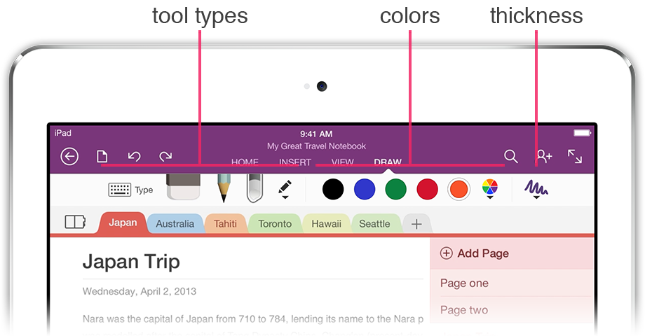
I arrived at a new model that put colors front-and-center as opposed to specific tools. This model separated the UI into three parts:
- tool type
- colors
- thicknesses
This provided users one-touch access to
- several preset colors
- all the tools
and two-touch access to
- a wider array of colors
- thicknesses
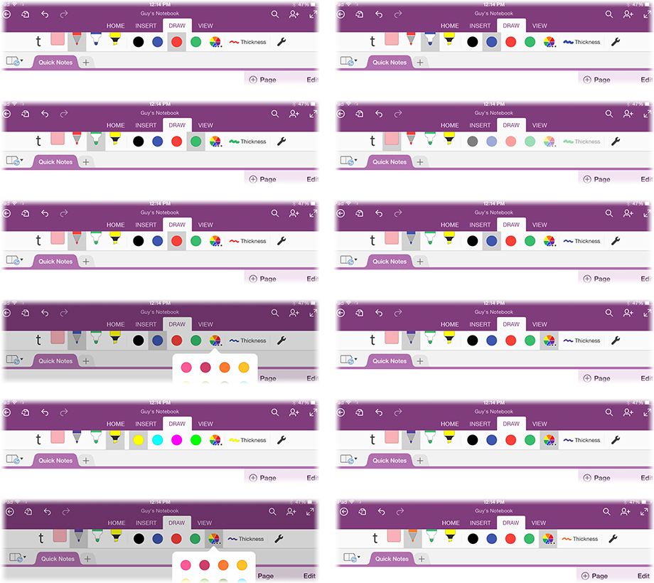
Validating the New Model
I produced thorough mockups of the UI. I used these mockups to conduct user tests on iPad using PowerPoint.
The tests showed that users clearly understood each part of the UI and they felt comfortable configuring it.
Can We Ship Sooner?
The Ribbon didn't allow for larger, full-bleed buttons like my designs called for; we needed to wait for another team to add support.
I created mockups to test using standard-sized buttons. With everything the same size, users didn't understand the relationship between tools, colors, and thickness.
I decided to wait and ship the better-understood design.
Write Naturally with a Stylus
OneNote needed smarts to be able to tell your touches apart from your stylus. You'd have to write awkwardly, hovering your hand above the screen's surface.
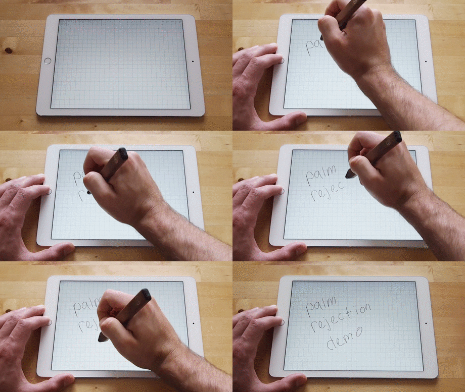
Which Touch Is the Stylus?
I observed that generally people hold their pen so that the tip is the most extreme point in a given direction. For a right handed person, the pen tip is the point furthest to the left.
With this observation, I designed a heuristic to distinguish the stylus from your palm. I built a prototype to validate my approach.
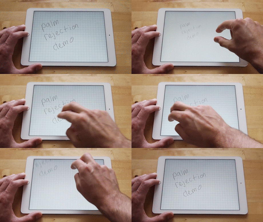
Telling Writing Apart from Panning and Zooming
Frequently, iOS considers you to be panning or pinching while writing with your hand on the screen. Pans or zooms interrupt your work.
Through experimentation, I found that iOS is rather lenient with its definitions for pinches and zooms.
I built my prototype to only acknowledge stricter versions of two-finger pans and zooms.
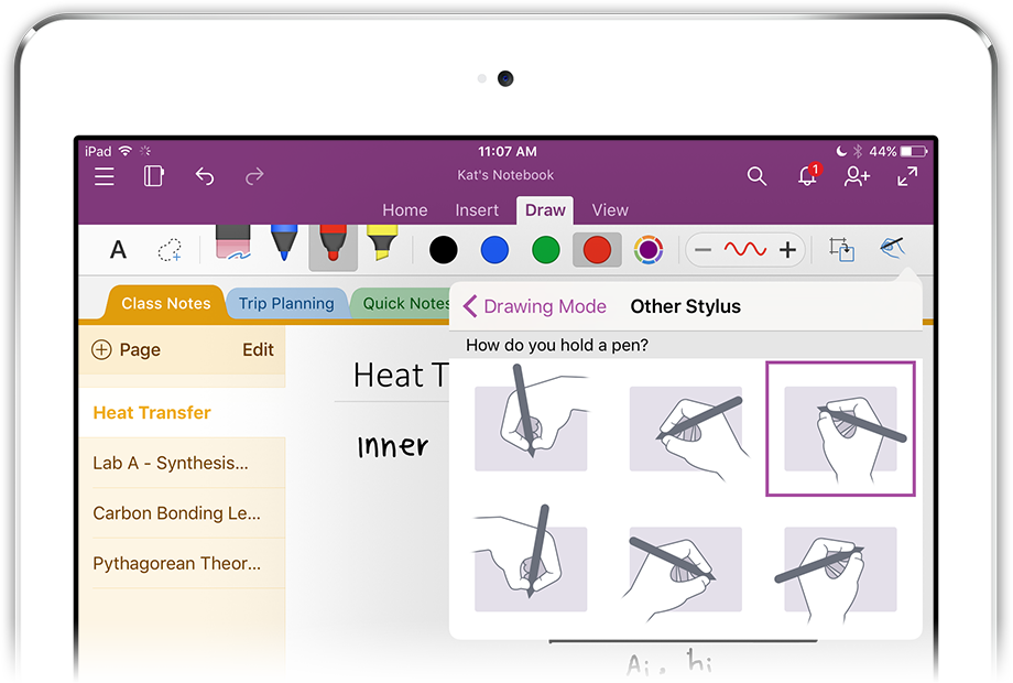
Making Sure It Works for Everybody
Engineers took my prototype's logic, expanded on it, and built it into OneNote.
By testing a wide array of users, we refined the design to work for
- the many ways people hold pens
- different languages
For example, through iterative testing, we improved handling of the short, straight strokes that are frequently used in Korean.
Results
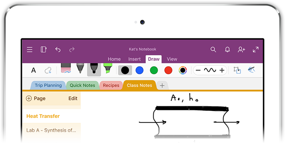
OneNote for iPad
Handwriting shipped in OneNote for iPad in February 2015.
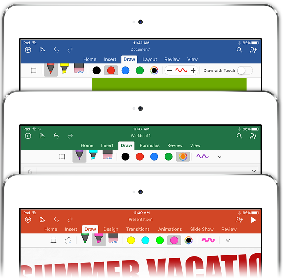
Microsoft Office for iPad
Later, Word, Excel, and PowerPoint on iPad all shipped the same interaction model.
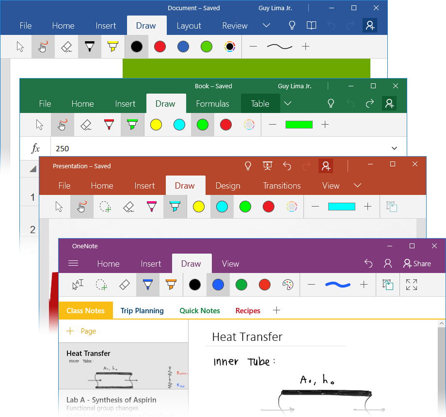
Microsoft Office for Windows 10
The same experience also later shipped across OneNote, Word, Excel, and Powerpoint on Windows 10.